
GARY Charts and Visualizations
GARY can generate over 130 types of charts, plots, and visualizations on demand using natural language. From simple bar charts to complex 3D surface plots, network graphs, and AI/ML visualizations, GARY transforms your CORAS data into mission-relevant visuals in seconds. Whether you need a Sankey diagram mapping funding flows, a candlestick chart for financial analysis, or a choropleth map showing geographic distribution, just describe what you need and Gary builds it.
Why This Matters
A funding brief that takes your analyst two hours to build takes GARY two minutes. The chart is grounded in your live data, adjustable in real time, and exportable for leadership review — no separate tool, no manual formatting, no waiting on someone else to build it.
How to Use
In any GARY conversation, describe the visualization you want in plain language. GARY selects the right chart type, maps your data to axes, and applies formatting automatically. You can refine the output by asking GARY to adjust colors, labels, axes, or chart type. For example:
"Create a Sankey diagram showing funding flow from sources to programs"
"Build a bar chart comparing readiness rates across squadrons"
"Show me a heatmap of activity by month and department"
"Generate a 3D scatter plot of cost vs. schedule vs. risk"
"Create a choropleth map showing program distribution by region"
"Build a waterfall chart showing budget changes over the fiscal year"
"Show me a Gantt chart of program milestones"
GARY will generate the chart using your CORAS data and display it inline. You can iterate on the design by asking Gary to adjust colors, labels, axes, or chart type.
Chart Catalog
Browse the full library of chart types Gary supports. Click any category to jump to its charts.
Fundamental Graphs
Basic Charts
Statistical Charts
Scientific Charts
Financial Charts
MapsAI
ML3D Charts
Bioinformatics
Subplots
Animations
Add Custom Controls
Jupyter
Widgets
Interaction
Fundamental Graphs
26 chart types
The Figure Data Structure
Creating and Updating Figures
Displaying Figures
Gary Express
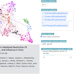
Analytical Apps with Dash
Static Image Export
Theming and Templates

Configuration
Setting Graph Size
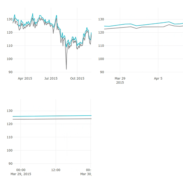
Formatting Ticks
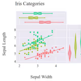
Setting the Font, Title, Legend Entries, and Axis Titles
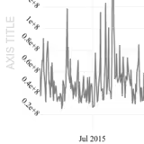
Axes
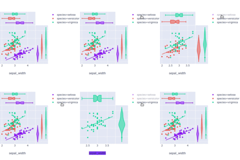
Legends
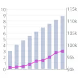
Multiple Axes
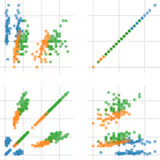
Subplots
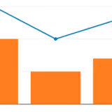
Multiple Chart Types
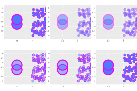
Styling Markers
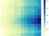
Continuous Color Scales
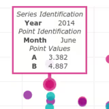
Text and Annotations
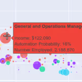
Hover Text and Formatting
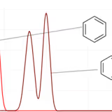
Images
Shapes
IPython vs Python
Figure Factories
Graph Objects
Selections
Basic Charts
17 chart types
Scatter Plots
Line Charts
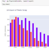
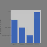
Bar Charts
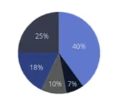
Pie Charts
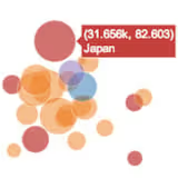
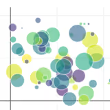
Bubble Charts
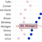
Dot Plot
Filled Area Plots
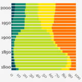
Horizontal Bar Charts
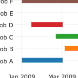
Gantt Charts
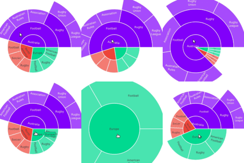
Sunburst Charts
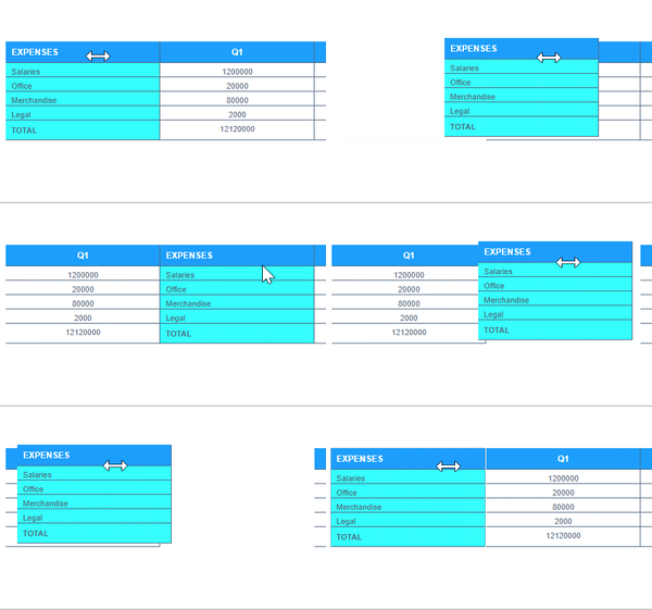
Tables
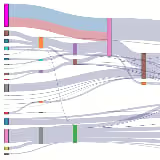
Sankey Diagram
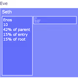
Treemap Charts
High Performance Visualization
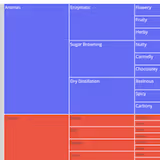
Icicle Charts
Patterns, Hatching, Texture
Dumbbell Plots
Statistical Charts
14 chart types
Error Bars
Box Plots
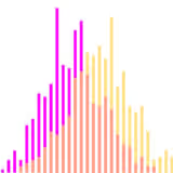
Histograms
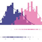
Distplots
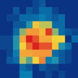
2D Histograms
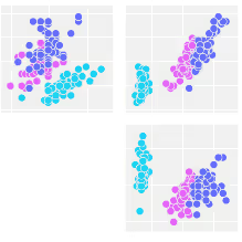
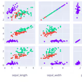
Scatterplot Matrix
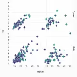
Facet and Trellis Plots
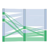
Parallel Categories Diagram
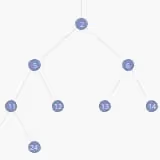
Tree-plots
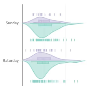
Violin Plots
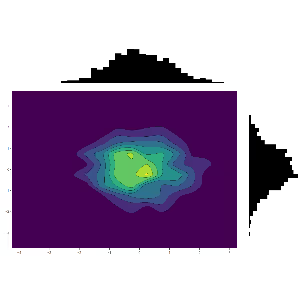
2D Histogram Contour
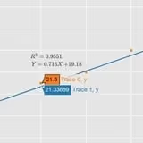
Linear and Non-Linear Trendlines
Marginal Distribution Plots
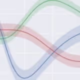
Continuous Error Bands
Scientific Charts
19 chart types
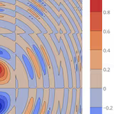
Contour Plots
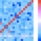
Heatmaps
Imshow
Ternary Plots
Log Plots
Dendrograms
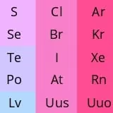
Annotated Heatmaps
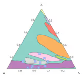
Ternary Overlay
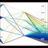
Parallel Coordinates Plot
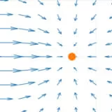
Quiver Plots
Streamline Plots
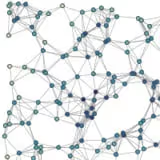
Network Graphs
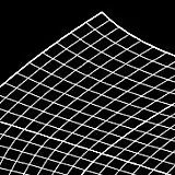
Carpet Plots
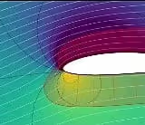
Carpet Contour Plot
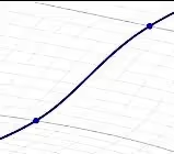
Carpet Scatter Plot
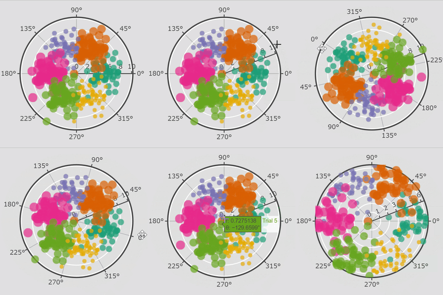
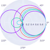
Polar Charts

Radar Charts
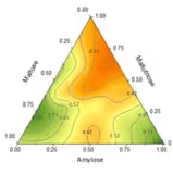
Ternary Contours
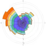
Wind Rose and Polar Bar Charts
Financial Charts
8 chart types
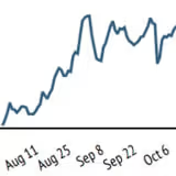
Time Series and Date Axes
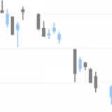
Candlestick Charts
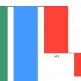
Waterfall Charts
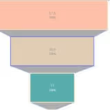
Funnel Chart
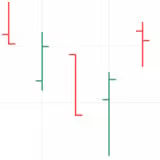
OHLC Charts
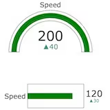
Indicators
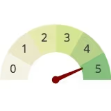
Gauge Charts
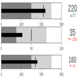
Bullet Charts
Maps
13 chart types
MapLibre Migration
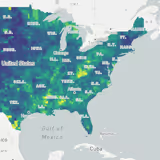
Tile Choropleth Maps
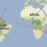
Lines on Tile Maps
Filled Area on Tile Maps
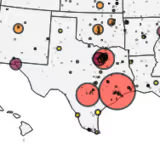
Bubble Maps
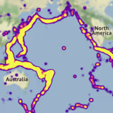
Density Heatmap
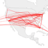
Lines on Maps
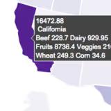
Choropleth Maps
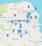
Scatter Plots on Tile Maps
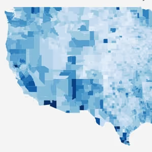
USA County Choropleth Maps
Scatter Plots on Maps
Map Configuration and Styling on Geo Maps
Hexbin Mapbox
AI and ML
6 chart types
ML Regression
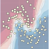
kNN Classification
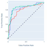
ROC and PR Curves
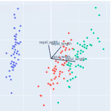
PCA Visualization
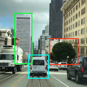
AI/ML Apps with Dash
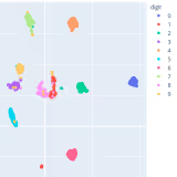
t-SNE and UMAP projections
3D Charts
13 chart types
3D Axes
3D Scatter Plots
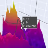
3D Surface Plots
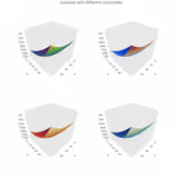
3D Subplots
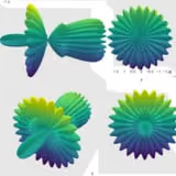
3D Camera Controls
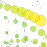
3D Bubble Charts
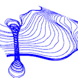
3D Line Plots
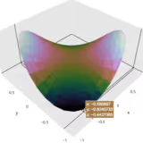
Trisurf Plots
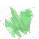
3D Mesh Plots
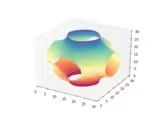
3D Isosurface Plots
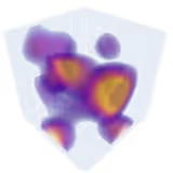
3D Volume Plots
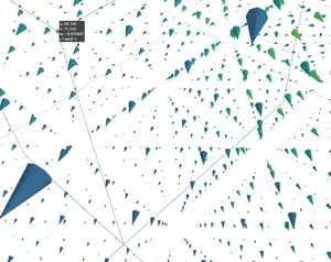
3D Cone Plots
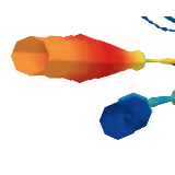
3D Streamtube Plots
Bioinformatics
4 chart types
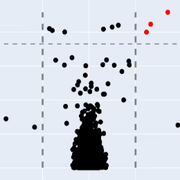
Volcano Plot
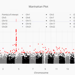
Manhattan Plot
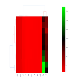
Clustergram
The Figure Data Structure
Subplots
4 chart types
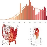
Mixed Subplots
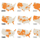
Map Subplots
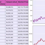
Table and Chart Subplots
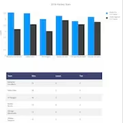
Figure Factory Subplots
Animations
1 chart type
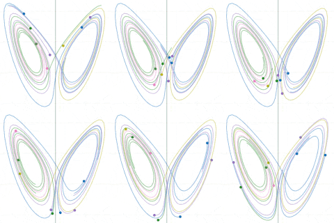
Animated Charts — bring time-series or scenario data to life with frame-by-frame animation
Custom Controls
4 chart types
Custom Buttons
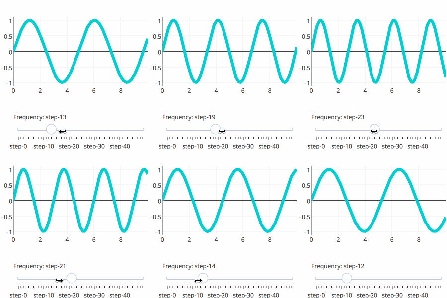
Sliders
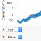
Dropdown Menus
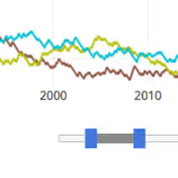
Range Slider and Selector
Jupyter Widgets Interaction
4 chart types
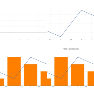
Gary FigureWidget Overview
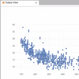
Jupyter Lab with FigureWidget
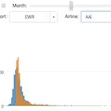
Interactive Data Analysis with FigureWidget ipywidgets
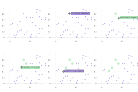
Click Events
Get Started
Open a Gary conversation in your CORAS workspace and describe the chart you need. Gary handles the rest — selecting the right chart type, mapping your data to axes, and applying formatting. Refine the output at any time by asking Gary to adjust any aspect of the visualization.
For SmartList-specific charts built directly from list data, see SmartList Charts.
Get Help
Contact your Customer Success Manager or visit the Customer Resource Center for additional support with Gary visualizations.